Pastel Aesthetics and Dopamine Design
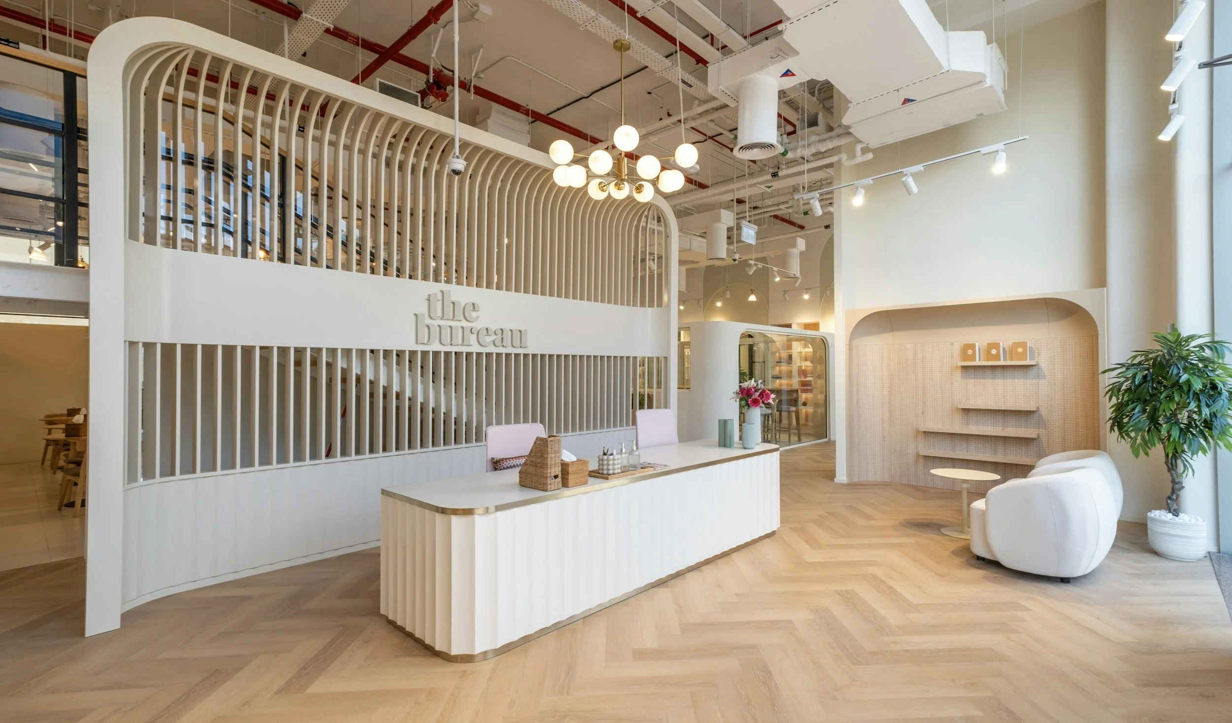
Creating Spaces That Support Spring Energy
Not that long ago, I tried one of those ChatGPT prompts that supposedly summarises your entire personality based on everything it thinks it knows about you from your conversations. And look — I am not going to pretend I wasn't a little defensive about it. I am infinitely more layered than anything an AI engine can compress into a paragraph, and I stand by that. But also. Also. It had a few points.
One of them was that I am obsessed with aesthetics and design.
Which — yes. Obviously. But what struck me was the specific way it framed it: not as a preference, not as a hobby, but as something closer to a need. And when I sat with that for a moment, I realised it was right in a way I had known about myself but never quite articulated. Aesthetics don't just please me. They regulate me. A well-designed space, the right colours, light falling at a good angle, something living on a desk — these things genuinely soothe my nervous system in a way that I had always registered but never really investigated.
So I did what I always do when something about my own biology surprises me: I went looking for the science behind it. Why does a carefully arranged space calm me down? Why does visual chaos feel like noise I have to push through? Why, every time the season starts to shift toward something brighter and warmer, do I get these almost irresistible design-change jitters — the ones that hit every couple of weeks in a low-grade way but arrive in full force as spring approaches — and why does acting on them always feel less like redecorating and more like recalibrating?
It turns out the answer is not "because you have an aesthetic personality type." The answer is neuroscience. And once you understand it, the urge to rearrange your entire living space the moment the light changes stops feeling like a quirk and starts feeling like one of the more intelligent things your nervous system does.
I wanted to write this one properly, because I suspect some of you will recognise yourselves in all of it. And if you do — keep reading, because understanding the why makes the whole thing a lot more intentional.
The Colour in Your Space Is Doing Something to Your Brain
Colour psychology has a complicated reputation. It sits at the intersection of genuine neuroscience and a vast quantity of oversimplified claims — "paint your office blue to be more productive," "yellow makes you anxious in large doses," a thousand interior design articles confidently asserting cause and effect that the research does not fully support.
So let's be honest about what the science does and does not say — and find the truth that is actually useful.
What is established: colour carries meaning that the brain processes automatically, before conscious interpretation. Research published in the Frontiers in Psychology confirmed that colour can significantly affect mood, cognition, and behaviour, and that these responses are driven by a combination of biological hardwiring and learned cultural association [1]. The key variables are not just hue — the "colour" in the way we usually think of it — but also lightness (how pale or dark a tone is) and saturation (how intense or muted it is). These two dimensions often matter more than the hue itself.
This is where pastels become interesting. Pastels are, by definition, low-saturation, high-lightness colours. They are colours with the intensity dialled down and the brightness dialled up. And this particular combination — light, soft, not demanding — has a measurable effect on how the nervous system interprets an environment. High-saturation colours demand attention and increase arousal. Low-saturation, high-lightness colours create what researchers describe as a backdrop of calm openness rather than stimulation [1]. Your brain doesn't have to work to process them. They don't compete. They create space.
Studies exploring mood responses to colour environments found that pastel and natural tones are consistently associated with feelings of calm and positive affect — in contrast to deep or highly saturated tones, which can tip into visual fatigue or heightened arousal when sustained [2]. A soft sage green or a warm butter yellow on a wall is not just pretty. It is metabolically cheaper to look at than a saturated cobalt or a rich burgundy, which means less ambient cognitive load — and more available attention for whatever you are actually trying to do.
This, by the way, is why my nervous system responds the way it does. It is not that I have an unusual sensitivity to aesthetics. It is that I have, apparently, been paying attention to what my brain was telling me — and my brain, like all brains, is running calculations about its visual environment constantly. The difference is whether you listen.
The spring palette, decoded:
Soft sage and mint greens carry visual associations with growth and living systems — which we will return to when we get to biophilic design. They have a calming, slightly activating quality that supports focus without forcing it.
Warm pastel yellows — not canary, not mustard, but the pale, butter-soft end of the spectrum — are associated in cross-cultural research with elevated mood, playfulness, and a sense of openness [2]. They literally carry more light than cooler tones and visually expand a space.
Pale lavender sits at the boundary of relaxation and creativity. Low arousal but not soporific. An environment the mind can move around in without bumping into edges.
Blush and warm peachy neutrals are simultaneously cocooning and open — they carry the warmth of red without any of its urgency, and they are the indoor tones most tonally aligned with the warm, golden-hour light quality of a bright season.
None of this requires repainting anything. A throw, a desk plant pot, a few stems in a vase, a piece of art — colour can enter a space in small gestures, and the brain responds to ambient colour, not just dominant colour.
Light Is Not Decoration. It Is Medicine.
If there is one thing in this post I want you to take as genuinely non-negotiable, it is this: the quality and quantity of natural light you receive during the day is one of the most powerful levers you have for mood, energy, cognitive performance, and sleep quality. It is not a nice-to-have. It is a biological requirement that most of us are radically under-fulfilling.
Light enters the eye and reaches a specialised set of photoreceptors — intrinsically photosensitive retinal ganglion cells — that are directly wired to the suprachiasmatic nucleus in the hypothalamus, the brain's master biological clock. This clock drives nearly every circadian rhythm in the body: cortisol release timing, melatonin production, body temperature fluctuation, digestive activity, immune function. When this clock is properly entrained — synchronised to the natural light-dark cycle — your biology runs well. When it isn't, almost everything suffers.
A landmark study of 109 office workers across multiple buildings found that those receiving higher levels of circadian-effective light during the day showed significantly better sleep quality, reduced depression scores, and stronger alignment between their internal biological rhythms and the external day-night cycle [3]. The effects were most pronounced in workers who received adequate morning light — the window when the circadian clock is most receptive to entrainment signals.
A separate study comparing workers in offices with windows against those in windowless environments found that workers with daylight access slept better, reported better quality of life, and showed measurably improved sleep efficiency [4]. The researchers noted that windowless workers were experiencing a kind of chronic circadian disruption despite functioning apparently normally — a slow-burning biological cost that accumulates invisibly.
This matters right now because as the season shifts and days lengthen, you are being offered significantly more circadian-effective light than you had two months ago. Your brain is primed to receive it. Whether your space actually allows that light in — or whether blinds, positioning, and artificial lighting drown it out — determines whether you genuinely benefit from it.
Practical light optimisation for your space:
Position your primary workspace as close to a window as possible — ideally so that natural light falls from the side rather than directly behind your screen. Open your blinds fully in the morning. This sounds almost insultingly simple, but research shows that the behavioural tendency to leave blinds partially drawn is one of the primary ways people unintentionally limit their daytime light exposure [3]. Mirrors placed opposite windows amplify and distribute natural light, extending it further into a room without any additional fixtures.
In the evening, the inverse applies. As natural light falls away, your indoor lighting should follow it. Warm, lower-intensity light in the hours before sleep supports melatonin onset and tells your nervous system the day is ending. Bright, cool overhead lighting suppresses melatonin and delays sleep onset — a bad trade, even if you feel fine in the short term.
Biophilic Design: Why Your Nervous System Needs Living Things Around It
Biophilia — the innate human affinity for the natural world — is not a poetic concept. It is evolutionary biology. Our nervous systems developed in natural environments over millions of years. The built environment, with its hard surfaces, artificial light, and absence of living systems, is an extraordinarily recent development that our brains are not fully adapted to. The consequence is a low-grade, often unnoticed ambient stress that accumulates in the body over time — and that natural elements reliably, measurably reduce.
A multisensory study of biophilic office environments found that cognitive performance improved across all biophilic conditions compared to a sterile baseline, and that stress ratings were significantly lower in environments combining visual, auditory, and tactile natural elements [5]. Participants reported greater workplace satisfaction, and the effects were consistent across multiple cohorts over eight weeks. This was not a subtle finding — it was robust and reproducible.
The research is also specific about what actually works. Not all greenery is equal and more is not always better. A moderate amount of living plants, distributed across a space rather than concentrated in one corner, produces the most reliable stress-reduction and mood outcomes [5]. Oversaturation with greenery can paradoxically reduce the effect — possibly because the brain's response to nature is partly about contrast, the presence of something organic against an otherwise built background.
What this means practically is that you do not need a jungle. You need presence. A few well-chosen plants on a desk or windowsill. A small vase of seasonal stems. Natural materials in objects you touch regularly — wood, linen, stone, ceramic. The sound of a window open to birdsong or wind in leaves. These are not trivial aesthetics. They are inputs to a nervous system that runs measurably better when it receives them.
And here is where the seasonal timing becomes relevant: spring's natural abundance works entirely in your favour. Flowering branches, herbs, leafy stems — living material is available, accessible, and at its most visually arresting right now. A small jar of whatever is growing or available on a desk is biophilic design that costs almost nothing and delivers a nervous system signal that no synthetic alternative can replicate.
Dopamine Design: When Aesthetics Become a Neurochemical Strategy
The phrase "dopamine design" has started circulating in interior and fashion spaces — sometimes thoughtfully, sometimes as a way to justify buying more things in bright colours and calling it self-care. The actual neuroscience behind it is worth understanding properly, because it is more nuanced and more interesting than the trend cycle suggests.
Dopamine is the neurotransmitter most associated with anticipation, reward, and motivated behaviour — the seeking drive. It is released not only in response to rewards but to novelty, to beauty, and to environments that signal possibility and abundance. And it is depleted by sameness, by grey monotony, by spaces that offer no visual variation or interest.
This means that a space deliberately designed to engage the eye — with colour, with natural variation, with objects that carry personal meaning — is not just a pleasant place to be. It is an environment that supports the neurochemical conditions for motivation, creativity, and sustained focus. You are not decorating. You are curating dopaminergic inputs.
And this, finally, is the science underneath the design-change jitters I mentioned at the beginning. The seasonal shift in light quality is already triggering a neurological response — your dopamine system registering novelty, change, possibility. The urge to rearrange, to refresh, to bring something new and living into your space is your brain asking for inputs that match the external signal it is already receiving. It is not restlessness. It is attunement.
The practical application of this is not maximalism or a shopping list. It is intentionality. A few objects that carry genuine sensory delight — a ceramic in a colour you find beautiful, a plant you actively enjoy looking at, a piece of art that catches your eye differently depending on the light — do more for your neurochemistry than a roomful of things chosen without attention. The brain responds to what it notices. Things you have stopped seeing no longer register. This is why rotating small elements — moving a plant, switching a throw, adding a single stem of something seasonal — can refresh the dopaminergic effect of a space you've inhabited for years.
Bringing It Together: A Practical Spring Reset
You do not need a renovation. You need alignment. Here is what that looks like in practice.
Let more light in, starting tomorrow morning. Open the blinds completely and position yourself as close to the window as your setup allows. This is the highest-leverage change available to you and it costs nothing.
Introduce one or two pieces of living material into your primary workspace. A plant you will actually look at. A small vase of whatever is in season. Something organic, something alive.
Audit the saturation level of your dominant colours. If your space is currently heavy, dark, and high-contrast, consider whether a lighter version of just one element — a throw, a cushion, a desk object — could shift the ambient tone. You are not going pastel for aesthetic reasons alone. You are lowering the visual noise your nervous system has to process all day.
In the evening, make your lighting follow the light outside. Warmer, dimmer, more directional. Less overhead. Candles if you like them — they are the original warm, low-intensity light source and there is a reason every culture in history has found them settling.
And finally: pay attention to what you notice. Dopamine design only works when the space still surprises you. The season is already doing its part — the angle of the light is changing daily, the world outside your window looks different than it did last week. Let that movement in. A space that breathes with the season is one that keeps telling your nervous system: something good is arriving.
Coming Back to That ChatGPT Moment
I am still not fully at peace with the fact that an AI summary of my personality was onto something. I maintain there is a lot it missed. But "obsessed with aesthetics and design in a way that soothes her nervous system" — that one landed, and it landed because it was true in a way I had been living without fully understanding.
Now I understand it. And that shift — from instinct to informed intention — is exactly the kind of thing that changes how you move through a space, a season, a day. You stop apologising for needing your environment to feel a certain way and start designing it deliberately, because you know it is not a preference. It is physiology.
So if you recognise yourself in any of this — in the jitters, in the seasonal pull, in the way a well-lit room with a plant on the desk feels fundamentally different to work in — you are not just someone with an aesthetic sensibility. You are someone whose nervous system is paying attention.
Trust it. Then design accordingly.
References
[1] Elliot, A. J. (2015). Color and psychological functioning: A review of theoretical and empirical work. Frontiers in Psychology, 6, 368. https://doi.org/10.3389/fpsyg.2015.00368
[2] Kurt, S., & Osueke, K. K. (2014). The effects of color on the moods of college students. SAGE Open, 4(1). https://doi.org/10.1177/2158244014525423
[3] Figueiro, M. G., Steverson, B., Heerwagen, J., Kampschroer, K., Hunter, C. M., Gonzales, K., Plitnick, B., & Rea, M. S. (2017). The impact of daytime light exposures on sleep and mood in office workers. Sleep Health, 3(3), 204–215. https://doi.org/10.1016/j.sleh.2017.03.005
[4] Boubekri, M., Cheung, I. N., Reid, K. J., Wang, C. H., & Zee, P. C. (2014). Impact of windows and daylight exposure on overall health and sleep quality of office workers: A case-control pilot study. Journal of Clinical Sleep Medicine, 10(6), 603–611. https://doi.org/10.5664/jcsm.3780
[5] Bringslimark, T., Hartig, T., & Patil, G. G. (2021). Biophilic office design: Exploring the impact of a multisensory approach on human well-being. Journal of Environmental Psychology, 77, 101682. https://doi.org/10.1016/j.jenvp.2021.101682